AI Dashboards Without SQL: Build BI Models From Plain-English Prompts
Build AI dashboards without SQL. Define outcomes in plain English; Karmaflow turns your prompts into a knowledge-graph data model, KPIs, and live charts — with executive examples across marketing, operations, finance, healthcare, manufacturing, and HR.

AI dashboards let business users ask questions in plain English and get back live charts, KPIs, and explanations — without writing SQL or waiting on the BI backlog. Instead of stitching data together by hand, you prompt an AI agent, and it returns an interactive dashboard grounded in your own data. This is what natural-language business intelligence looks like in 2026.
For the technical mechanics — how the prompt-to-graph pipeline works under the hood — see our companion piece on AI conversation analytics with knowledge graphs. This post is the plain-English version, with six executive examples across industries.
Why traditional BI requires SQL — and how AI dashboards change that
For decades, BI meant defining measurement models in advance, writing SQL, and designing static reports. Dashboards were mostly backward‑looking — they show what did happen, based on predefined assumptions. That approach is slow to adapt and often misses the “why.”
Generative AI flips the script. Thanks to modern LLMs, we can converse with data. Instead of hunting for the right SQL, a user can ask: “Why did customer churn spike last quarter, and what are the leading indicators?” An AI agent interprets the prompt, sifts across sources, and returns an answer — often as a dynamic chart or dashboard.
This new paradigm is qualitative. It looks at rich context and relationships, not just rows and columns. It’s powered by a stack combining vector embeddings, knowledge graphs, and AI agents.
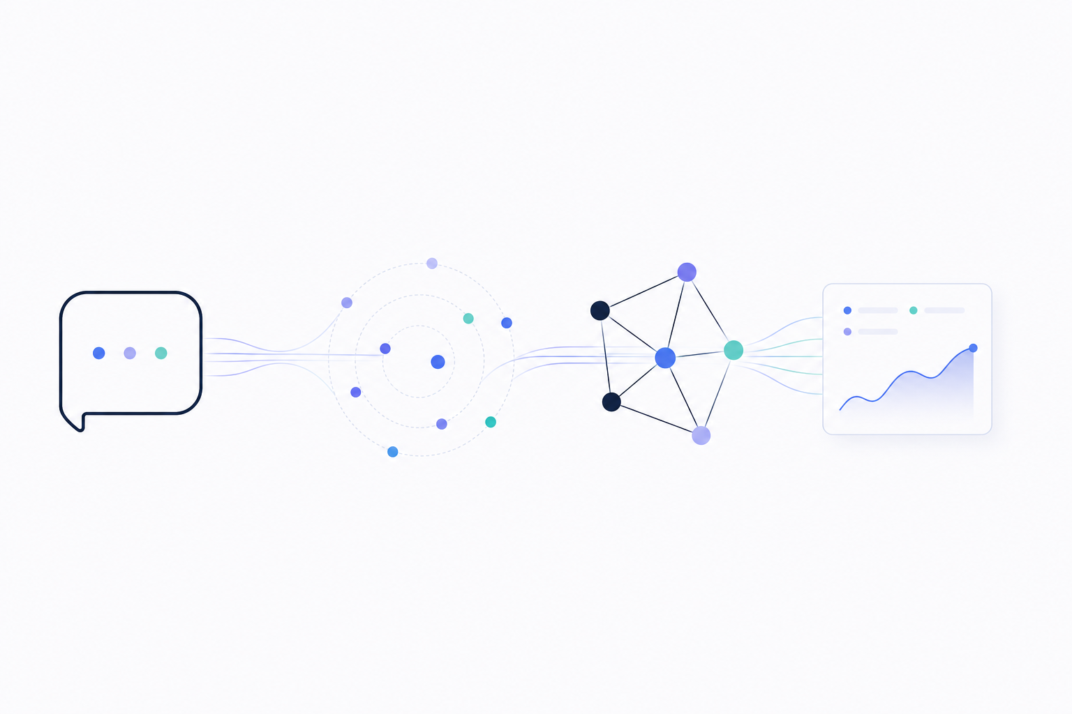
Figure 1: An AI dashboard turns a plain-English question into a knowledge-graph query, traverses the connections, and renders the answer as a live chart.
How the flow works:
- Prompt — the user asks a business question in plain English (“Which topics drove churn prevention last quarter?”)
- AI agent — interprets intent, plans the work, and decides which data to pull
- Knowledge graph — supplies the connected context: people, topics, channels, outcomes
- Dashboard — renders the answer as a chart, KPI, and plain-English explanation
How AI dashboards work: embeddings, knowledge graphs, and agents
Vector embeddings: how AI reads unstructured data
Embeddings represent unstructured data (text, audio, etc.) as numeric vectors in a high‑dimensional space. Similar meanings sit near each other (“customer canceled subscription” ~ “user did not renew”). They capture nuance like tone or intent, not just keywords. In plain English: embeddings let the AI “get the gist” of qualitative data at scale.
Knowledge graphs: the AI’s world map of your business
If embeddings are the ability to read, knowledge graphs are memory and context. A knowledge graph links people, products, behaviors, and outcomes via relationships. It integrates diverse data (CRM, marketing touchpoints, support tickets, public data) into one connected model. Hidden patterns — clusters, influence chains — become visible. In plain English: the graph is the AI’s world map of your business.
AI agents: the engine that turns prompts into dashboards
Agents (built on LLMs) are autonomous problem‑solvers. They take goals, break them into tasks, query data, call APIs, and synthesize answers. They traverse the graph, use embeddings to understand content, and present executive‑friendly outputs — explanations, charts, even draft plans. Grounded in graph context, they reduce hallucinations and improve traceability.
Putting it together: from prompt to live dashboard
You type a prompt. The agent identifies required data, uses embeddings to find relevant unstructured signals, queries the graph to connect facts, and synthesizes a dashboard answer you can drill into.
6 industry examples: AI dashboards in action
1) Marketing: real-time customer-intent dashboards
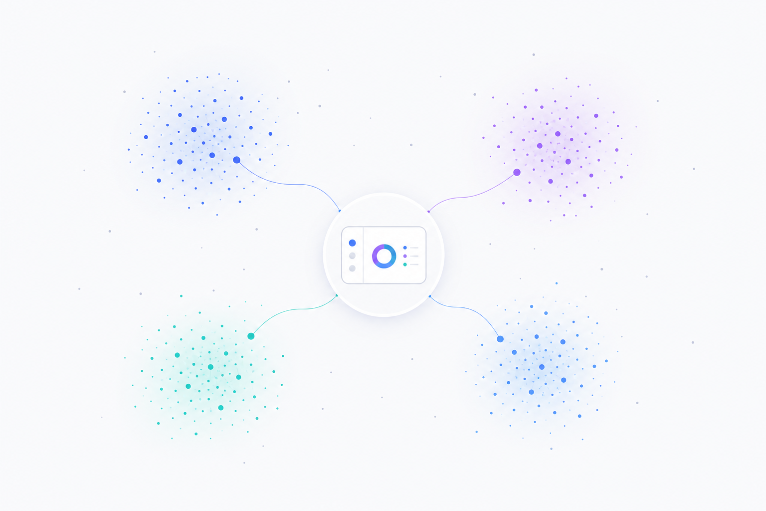
Figure 2: An AI marketing dashboard surfaces emerging concept clusters from customer conversations — each cluster a distinct theme — and links them back to a real-time dashboard tile.
How marketing AI dashboards work:
- Listens across channels — calls, chats, reviews, support tickets, social mentions
- Clusters by meaning, not keyword — embeddings group “won’t renew” with “considering cancellation”
- Links themes to revenue — the graph connects clusters to deal size, sales cycle, and account tier
- Surfaces the breakout theme — flags the cluster that correlates with this quarter’s largest deals
Executive pitch — Move from reactive attribution to predictive market‑shaping by mapping the ecosystem of customer intent.
The complex problem — Linear attribution misses the multi‑touch, multi‑channel journey and the “why” behind outcomes.
Magic of the stack — Embeddings convert comments, transcripts, reviews into concept vectors; the graph links concepts to customers, campaigns, products; agents detect emerging clusters that correlate with revenue.
How it works — Touchpoints stream into the graph. Concepts emerge and link to contacts and content. An agent tracks “top emerging clusters among high‑LTV accounts,” correlates themes to deals, and drafts a campaign brief.
Executive wow — A dynamic concept‑cluster map highlights a rising “Resilience Tech” theme tied to larger deal sizes, plus a target list and a campaign outline.
2) Operations & supply chain: a digital twin for disruption response
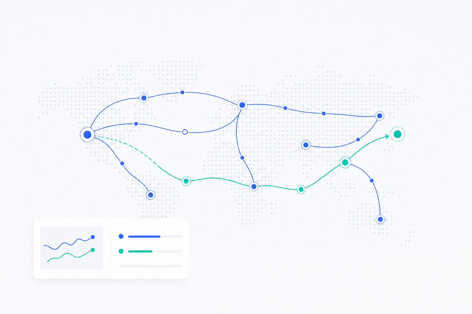
Figure 3: An AI supply-chain dashboard maps the global route network. When a disruption hits, the agent simulates alternates (mint route) and recommends the cost-aware reroute (blue route).
How supply-chain AI dashboards work:
- Models the network in a graph — suppliers, routes, warehouses, and dependencies
- Ingests real-time signals — news, weather, port alerts, supplier-status updates
- Simulates alternates in seconds — alt suppliers, express shipping, buffer stock, partial reroutes
- Drafts the response — POs, route changes, and a customer-impact summary, before the next inbox check
Executive pitch — A live simulation that predicts disruptions and auto‑game‑plans responses.
The complex problem — Static dashboards don’t capture second‑/third‑order effects across a global, multi‑tier network.
Magic of the stack — The graph models suppliers, routes, warehouses, and dependencies. Embeddings ingest real‑time unstructured signals (news, alerts). An agent runs scenario simulations to maintain delivery SLAs.
How it works — A supplier outage triggers the agent to traverse dependencies, simulate reroutes (alt suppliers, 3D print, buffer stock), and recommend an optimal, cost‑aware plan with draft POs.
Executive wow — “Shift 70% to MX supplier, express‑ship 30% from EU stock; preserve all customer dates, +0.2% margin impact.” Visual diff of original vs. adjusted network.
3) Finance & risk: synthetic fraud-ring detection
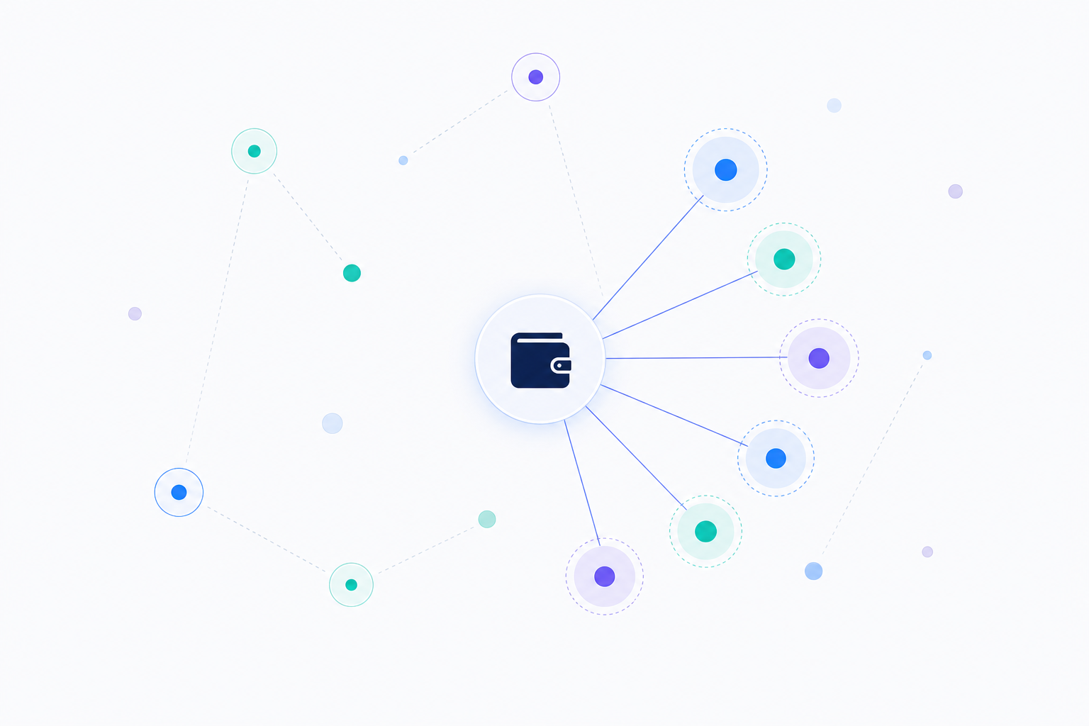
Figure 4: An AI fraud-detection dashboard identifies a coordinated ring — multiple synthetic accounts funneling activity through a shared wallet — before the first major loss event.
How fraud-detection AI dashboards work:
- Models behaviors as vectors — embeddings create a behavioral fingerprint per account
- Maps relationships in a graph — accounts, devices, IPs, merchants, wallets
- Detects ring topologies — accounts with high behavioral similarity converging on shared endpoints
- Proposes interdiction — flags the cluster for freeze before the ring activates
Executive pitch — Identify coordinated rings before they execute by detecting ghost patterns of setup activity.
The complex problem — Individually benign accounts/transactions form suspicious structures only when connected.
Magic of the stack — The graph links accounts, devices, IPs, merchants, wallets. Embeddings create behavioral fingerprints. Agents hunt for high‑similarity clusters and ring topologies.
How it works — The agent finds a cluster of new accounts with similar behavioral vectors funneling to a common wallet, flags a staging ring, and proposes interdiction.
Executive wow — “Coordinated network of 50 synthetic accounts; preemptively frozen; estimated loss prevented: $15M.”
4) Healthcare & life sciences: dynamic patient-journey mapping
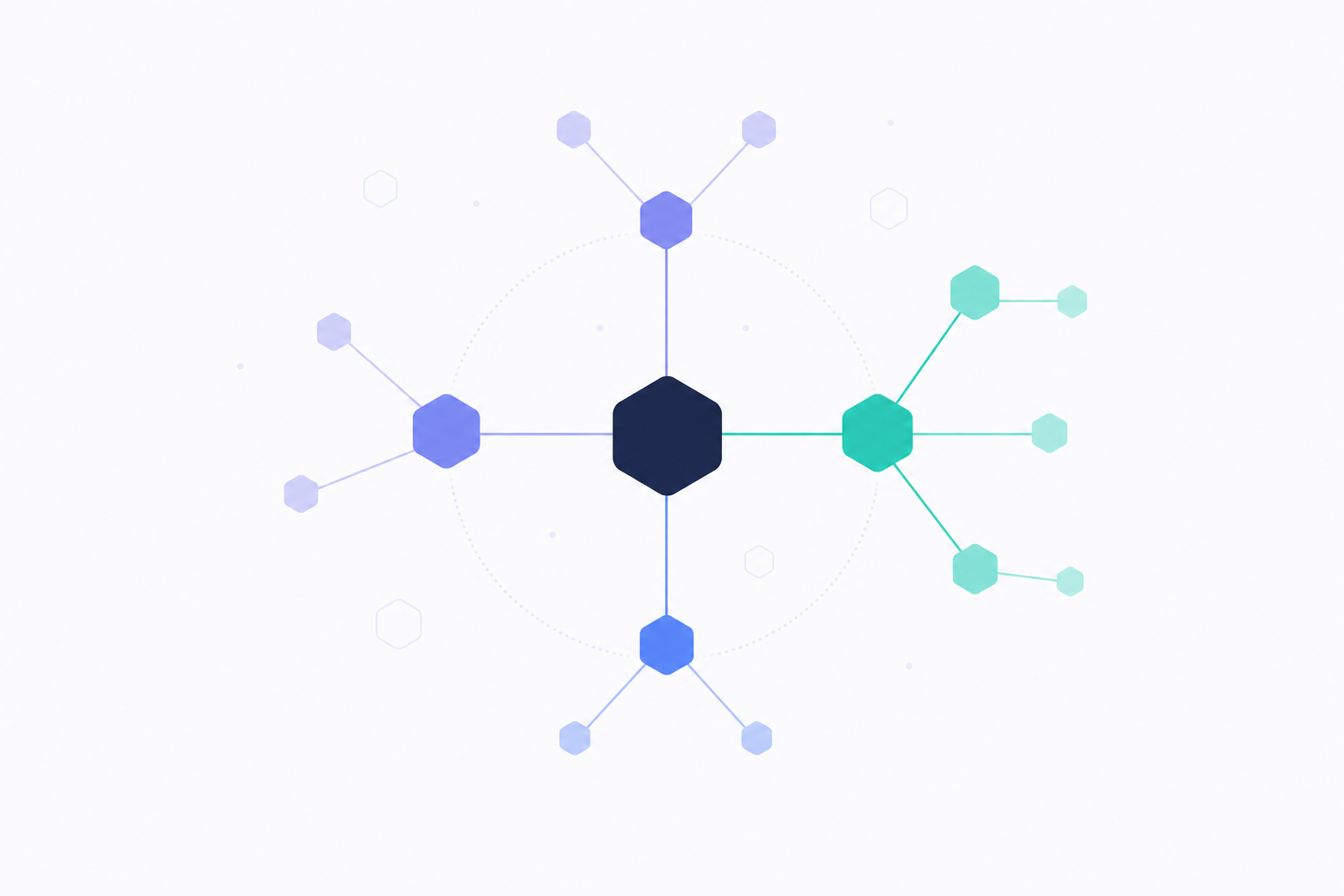
Figure 5: An AI healthcare dashboard links clinical-trial cohorts to real-world evidence through molecular-pathway connections, surfacing pharmacogenomic side-effect signals.
How healthcare AI dashboards work:
- Unifies trial data and real-world evidence — drugs, diseases, genes, patients, outcomes in one graph
- Maps patient language to medical concepts — “stomach feels off” → standardized GI discomfort
- Traverses molecule-to-market queries — BRCA2 carriers vs. non-carriers, on Drug X
- Proposes mechanism — connects observed side-effects to known protein interactions
Executive pitch — Connect trials to real‑world evidence to discover who benefits, who is at risk, and why.
The complex problem — Trial data and RWE live in silos and don’t translate easily across formats.
Magic of the stack — The graph unifies Drugs, Diseases, Genes, Patients, Outcomes. Embeddings map patient‑reported effects to standardized concepts. Agents traverse molecule‑to‑market queries.
How it works — The agent compares BRCA2 vs. non‑BRCA2 cohorts, surfaces elevated GI effects, and proposes a plausible mechanism via pathway links.
Executive wow — “Profile suggests pharmacogenomic side‑effect; pursue companion diagnostic; focus market on lower‑risk cohort.”
5) Manufacturing & industrials: predictive downtime prevention
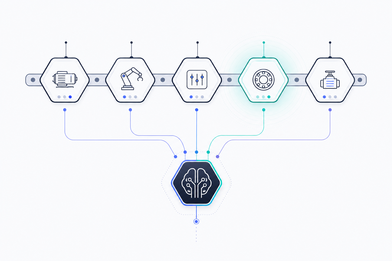
Figure 6: An AI manufacturing dashboard detects multi-sensor pre-failure signatures across a production line (highlighted machine in mint) and feeds the signal to a central agent for intervention.
How manufacturing AI dashboards work:
- Graphs machine interdependencies — every machine, sensor, and downstream impact mapped
- Embeds multi-sensor state — vibration, temperature, coolant viscosity collapsed into a single state vector
- Recognizes pre-failure patterns — matches current state to historical bearing-stress cascades
- Recommends intervention — line-speed reduction, targeted maintenance window, work order drafted
Executive pitch — Fix processes before they create failures by detecting multivariate pre‑failure signatures.
The complex problem — Many small deviations combine into a breakdown; single‑metric rules miss the pattern.
Magic of the stack — The graph captures machine interdependencies. Embeddings compress multi‑sensor states. Agents detect learned signatures (e.g., bearing‑stress cascades) and recommend preemptive adjustments.
How it works — The agent spots a high‑similarity match to a historical failure pattern and recommends a temporary line‑speed reduction plus a targeted maintenance window.
Executive wow — “Preventative action avoids ~$1.2M downtime; work order drafted; trend graphs and affected components highlighted.”
6) Human resources: organizational network analysis
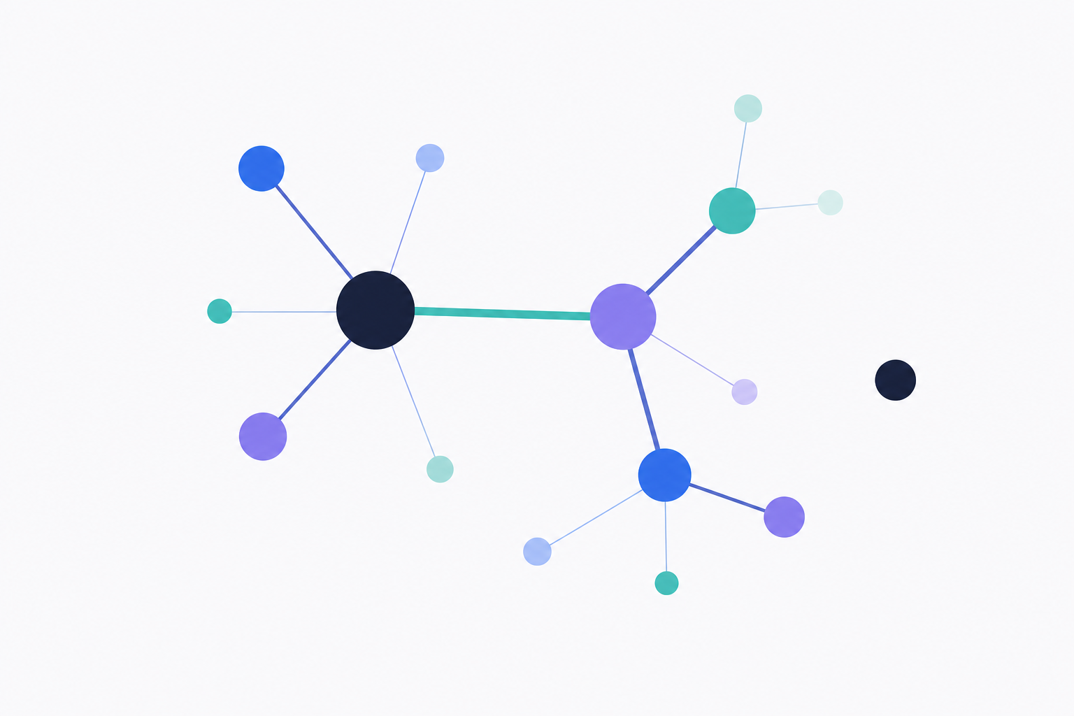
Figure 7: An AI HR dashboard maps the real collaboration network — hub influencers (large nodes), the critical-bridge connection (mint highlight), and emerging silos (the isolated node).
How HR AI dashboards work:
- Models the organization in a graph — employees, teams, projects, skills, interaction patterns
- Embeds collaboration metadata — distinguishes “FYI” exchanges from real working sessions (without reading message content)
- Surfaces hidden influencers — high betweenness centrality reveals informal leaders
- Flags single-point-of-failure risk — critical bridges, overloaded hubs, and teams drifting into silos
Executive pitch — Reveal hidden influencers, bottlenecks, and silos by mapping real collaboration networks.
The complex problem — Org charts miss informal networks; surveys miss interaction patterns.
Magic of the stack — The graph models employees, teams, projects, skills, and interactions (privacy‑preserving). Embeddings classify interaction types. Agents monitor graph health and centrality.
How it works — The agent flags overloaded hubs and teams drifting into silos; suggests load‑balancing, liaisons, or rotations.
Executive wow — “Sarah is a critical bridge; mitigate single‑point‑of‑failure risk. Platform Dev shows −60% cross‑team links; re‑establish connections.”
Why AI dashboards beat static BI
Across domains, the pattern repeats: embeddings provide understanding, graphs provide connected context, and agents provide reasoning and action. The result is living systems that learn continuously, detect patterns, and act — not static reports.
Executives can ask questions (prompts) and receive on‑demand, context‑rich answers (dashboards) without writing SQL or waiting on long backlogs. Humans shift to curators and decision‑makers, guided by traceable insights.
Frequently asked questions
What is an AI dashboard?
An AI dashboard is a business-intelligence interface where the user asks questions in plain English and an AI agent returns the chart, KPI, or written answer. Behind the scenes, the agent compiles the question into queries against a knowledge graph (or warehouse), retrieves and reasons over the result, and renders it back as a dashboard tile. The user never writes SQL or defines a schema by hand.
Can AI dashboards really work without SQL?
Yes — for the user. The SQL (or graph query) is generated by the agent, run against the underlying store, and shown to the user for auditability if they want to see it. You describe the outcome you want; the agent handles the query language. This is the core promise of natural-language BI.
How does an AI dashboard handle the schema design that BI usually requires?
The schema is derived from your prompts. When you describe an outcome (“tag conversations as Prevented Churn when…”), the agent infers the entities (Conversation, Outcome, Channel), the relationships, and the labels — and writes them into a knowledge graph. There’s no separate “data modeling” phase; the model emerges from how you describe the business.
What’s the difference between an AI dashboard and a BI dashboard with a chatbot?
A chatbot on top of Tableau or Power BI translates a question into a filter on a pre-built dashboard — you’re still limited to the metrics someone modeled in advance. An AI dashboard works against a knowledge graph that captures qualitative context (intent, sentiment, outcomes, relationships), and the agent reasons across it. The output isn’t just a filtered chart; it’s a fresh answer with the query, the chart, and the explanation.
Do AI dashboards replace BI tools like Tableau or Power BI?
Not in most environments — they sit alongside. Tableau/Power BI remain great for highly structured, well-understood metrics like revenue and headcount. AI dashboards win where the question is qualitative ("why did churn spike?"), the data is messy (transcripts, tickets, notes), or the schema isn’t pre-modeled. Most teams will run both.
How long does it take to deploy an AI dashboard?
Less than 24 hours for a first cohort. You describe outcomes in plain language; the platform compiles the data model, labels, and KPIs automatically. See our AI data analyst workforce for what this looks like running continuously, and the CAA NEO case study for a real 2-week go-live.
See it on your own data
Ready to see what AI dashboards look like with your data? Schedule a 15-minute consult — we’ll load a recent cohort, run your prompts, and show the KPIs and insights live. Or explore the AI data analyst workforce to see continuous, agent-driven analytics in action.
Also see: AI Conversation Analytics: Knowledge Graphs Beyond Dashboards · CAA NEO Case Study: 80% Autonomous Member Resolution, 24/7
Are you ready to have a conversation with your data? It’s ready to talk. What would you ask first?
- AI Dashboards
- Natural Language BI
- Conversational Analytics
- AI Business Intelligence
- No-Code Analytics
- Knowledge Graph
- Neo4j
- AI Analytics
- Generative AI
- Attribution